Devlog - GRAPHICS BABY!
HOT DOG THIS IS WHERE I SHINE, LETS TALK AESTHETICS! (49 hours logged in procreate on this one file lets gooooooo)
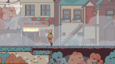
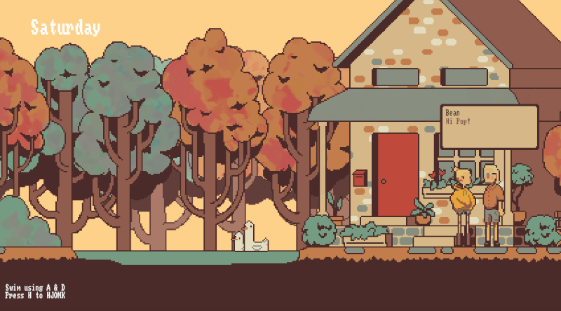
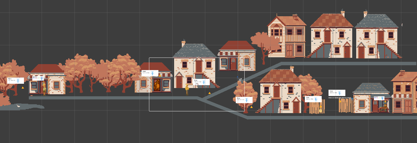
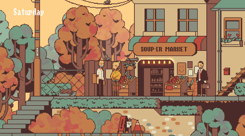 Welcome to Soup Town! (Upper Soup Town)
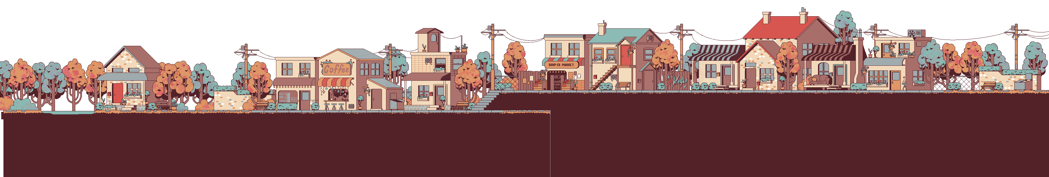
Environment
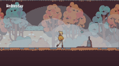
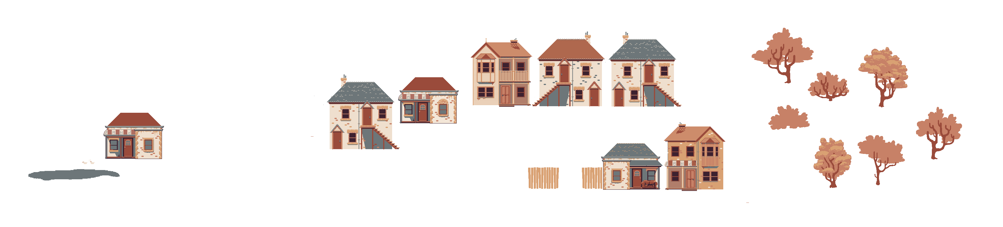
Soup Weather is set in Soup Town (yes, the main reason it is called Soup is for the supermarket wordplay), a little community slowly making its way into deep Autumn. The first major decision for Soup Town was the colour palette, it needed to capture all the warm colours of autumn but maintain the idea of cooling weather. First sketches of the town and colour palette were close but it was a little too warm and missing contrast - it honestly looked a little boring. After multiple iterations of the style and layout, one of the biggest changes was adding consistent pops of teal to the scene (wow it suddenly isn't so boring!) Using some atmospheric mist (and some heavy mist later in the game) I think I achieved some pretty good Autumn vibes!
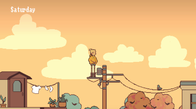
One of a few aesthetic look out spots in Soup Town
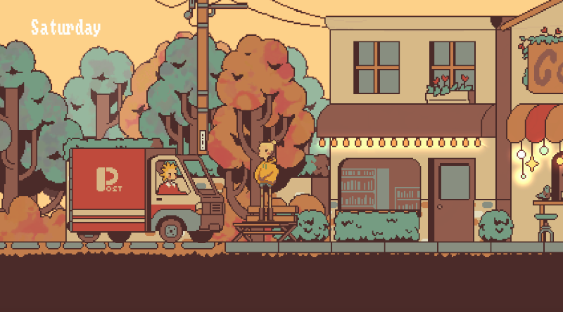
Lower Soup Town area
Soup Town's main street
Soup Town on a misty day
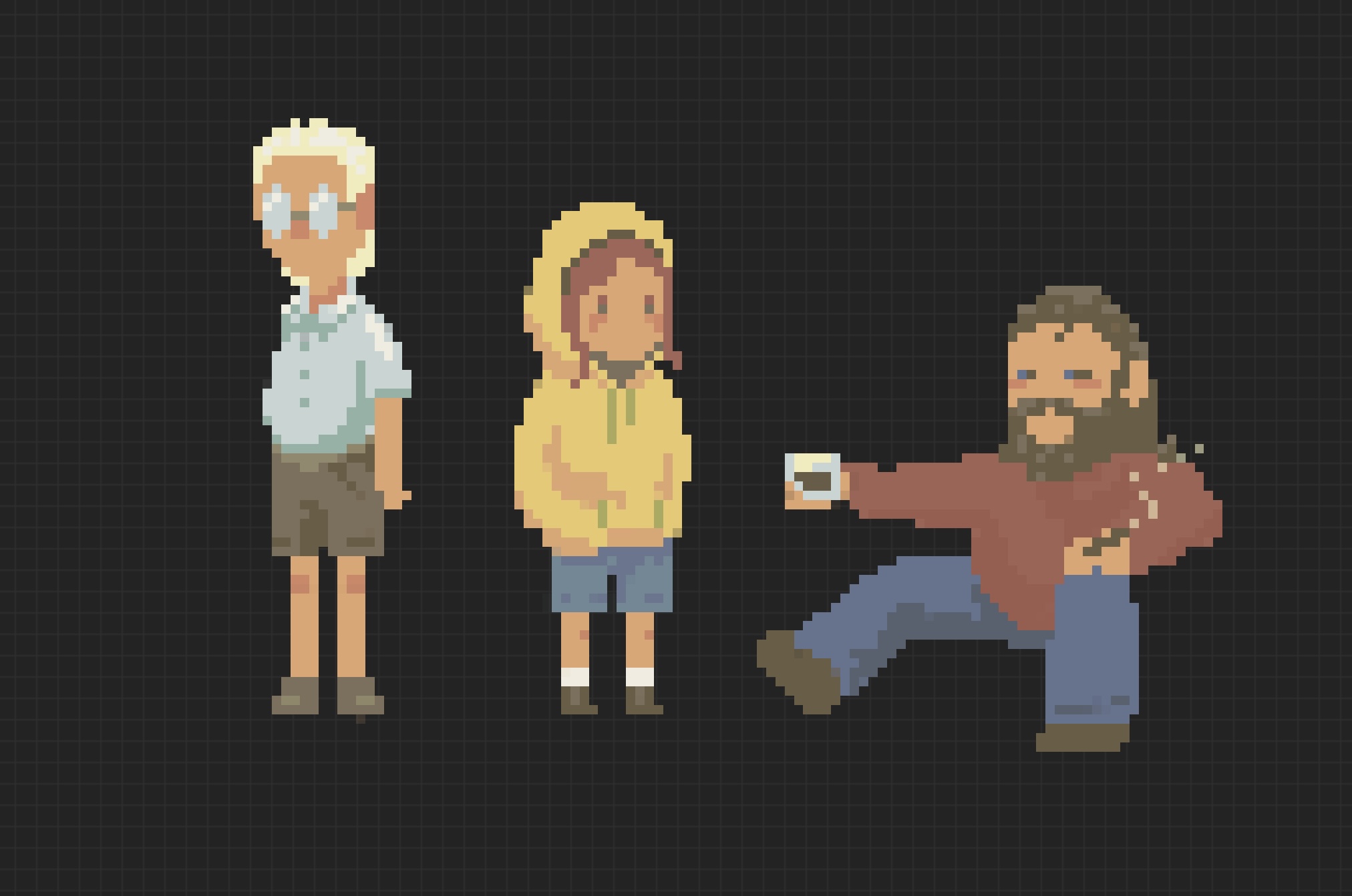
Bean
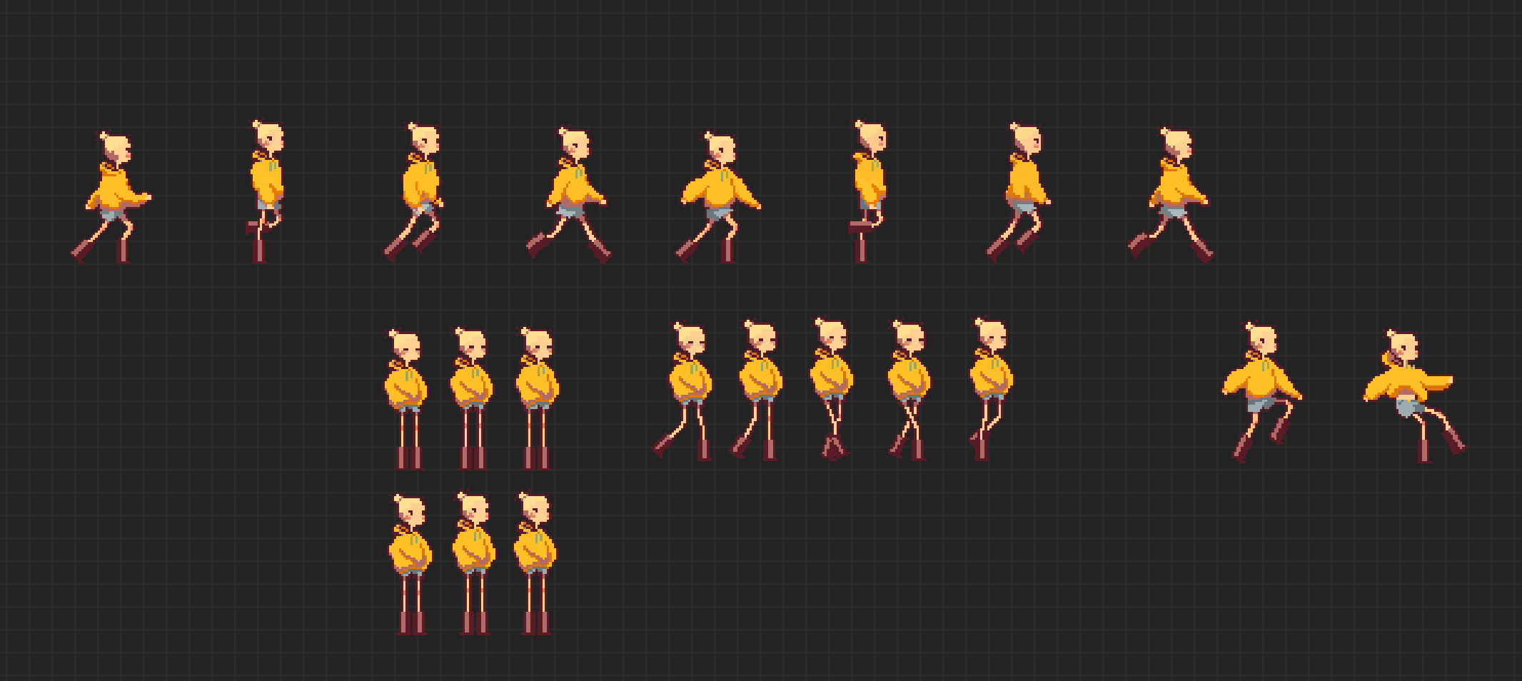 Bean's final design
Bean's initial design was a little lacking in silhouette, and so I redrew her to be a little more interesting. I wanted to give her some interesting shape with the poofy jumper, stick legs and big ol stompers, this shape also made animating her walking and jumping movements easier. After redrawing the environment, Bean's more muted colours got a little lost so I redrew her for a third time, giving her an outline and more contrast. Bean's design sort of set the tone for the rest of the NPC characters, giving me a frame of proportions and overall style to work with. Bean falls into what I'm calling a "soupy" mood later in the game so she has a second set of sprites for these movements.
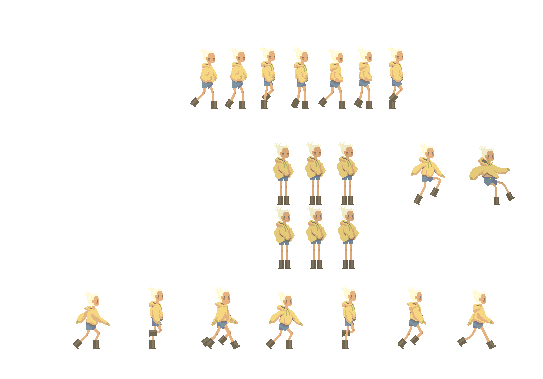
Beans first re-design featuring her Big ol' Stompers
Bean's "soupy" animation sprites
NPC's and animations

The other characters in the game didn't receive much tweaking between sketching and the final sprites as I had a pretty solid idea of the style and palette by this stage. Most of the NPC's are on a three sprite loop to give them a little bit of life in the scene (they basically just bob up and down a bit) and some have different poses as well.
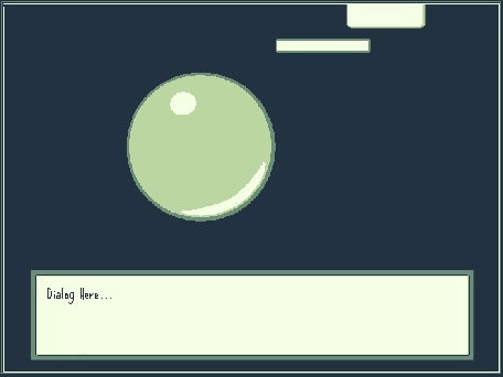
UI elements
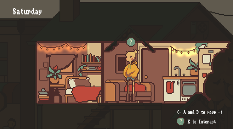
Pop's house - some UI instructions
UI elements are in the same pixel style as the rest of the graphics and using the same colour palette which I think works well, however I've gotten some feedback that the interaction indicators blend in too much so I plan on redrawing it to contrast from the world more. On the first game day there are some instructions for movement in the pixel font that disappear once the player leaves Bean's apartment.
Mini Games
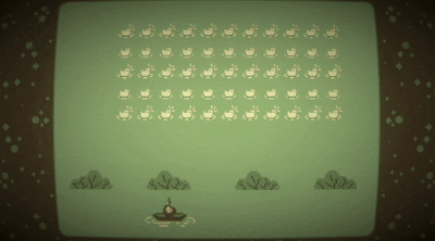
HUNTIN SEASON 2 - REVENGE OF THE DUCKS is the first mini game you get to play with Bo. As Bo has a bit of a cowboy vibe I wanted to make the invaders game into a hunting sim except the ducks are also shooting back. I added some distortion as Bean is playing it in the world with Bo so I wanted it to appear like its own screen.
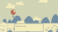
Hot Air Balloon Dream is the second mini game you get to play as Bean. this one is meant to be a dream that bean is having between game days and the dialogue communicates that to the player. I'm not sure the graphics communicate it as a dream though and it i have time i may redraw the sprites in the same style as the rest of the game so it blends into the narrative.
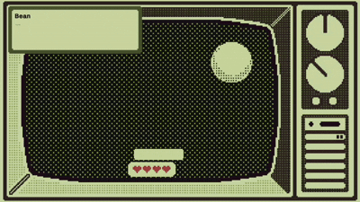
Grief Pong is the third mini game, again it is a part of the main story and after reflecting on the aesthetics of the game as a whole I think the tv frame needs to be in the same style as the rest of the game (and the tv contents stay different). The premise of the ball bouncing within a tv screen is something I am happy with so it is just a matter of changing the style and keeping the imagery :)
Feedback:
- Indicator icon not contrasting enough - thinking I might use the yellow in Bean's jumper as thats not apart of the environment palette and could stand out more.
- Need another icon (e) to prompt continuing dialogue as its unclear and the player can just walk off.
- The day of the week also wasn't noticeable a lot, I want to make a pause menu that will have that in it but will depend on time.
- Because the post van moved every day, it felt like an indicator to guide the player to where things are on the rooftops - I really like this idea as I have given the player the ability to jump on top of the post van and there are side narratives happening up there so I think I will correlate the van placement with the events happening above.
For reference of where we came from lets take a look at some earlier designs that were scrapped (boooooooo)
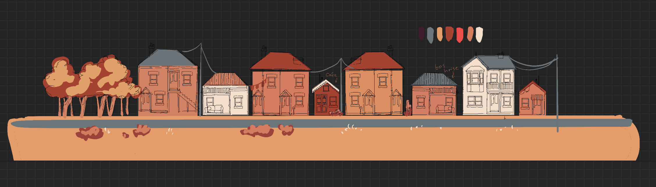 First sketch of Soup Town and deciding general colour palette
 First iteration of Soup Town layout
 Bean (and Bo and Pop)'s first designs
Grief Pong concept (spelling is my enemy)
Brie out, Have a soupy day! :)
Leave a comment
Log in with itch.io to leave a comment.